The Lighthouse
A brand system for founders' first true believers, before traction, headlines, or hype.
The Lighthouse is a pre-seed fund that backs founders at the stage before traction, and it wanted to look like the room a founder walks into, not the firm across the table. I built the brand alone, from the core belief to the bolt, the voice, the photography direction and the expressions, and delivered it as twenty-four pages of guidelines in 2026.
Highlights
- The core belief written as what a lighthouse says
- A bolt for the instant conviction becomes a decision
- One voice, tuned to founders, LPs and the room
- Photography directed as moments someone was in
- A system in two halves: what drives it, what holds it
The stage
Pre-seed is the stage with the least to show. A founder there has a belief, a few people and no number that proves anything, and the fund that backs them is the first outside party to say yes. The Lighthouse puts that in its own words: your first true believers, and on its site, “we help you win first and when you're ready, we hope you'll take our check.” That promise lived as a sentence. The brand had to make it something a founder could feel from a deck cover or a poster on a brick wall.
I built the brand around what a lighthouse says to someone still out there: you're not alone, keep going, this way.
The light
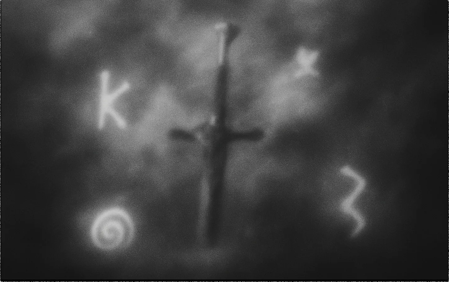
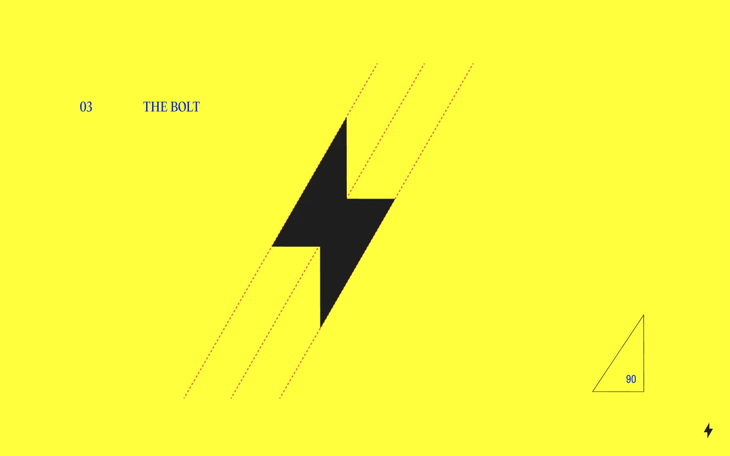
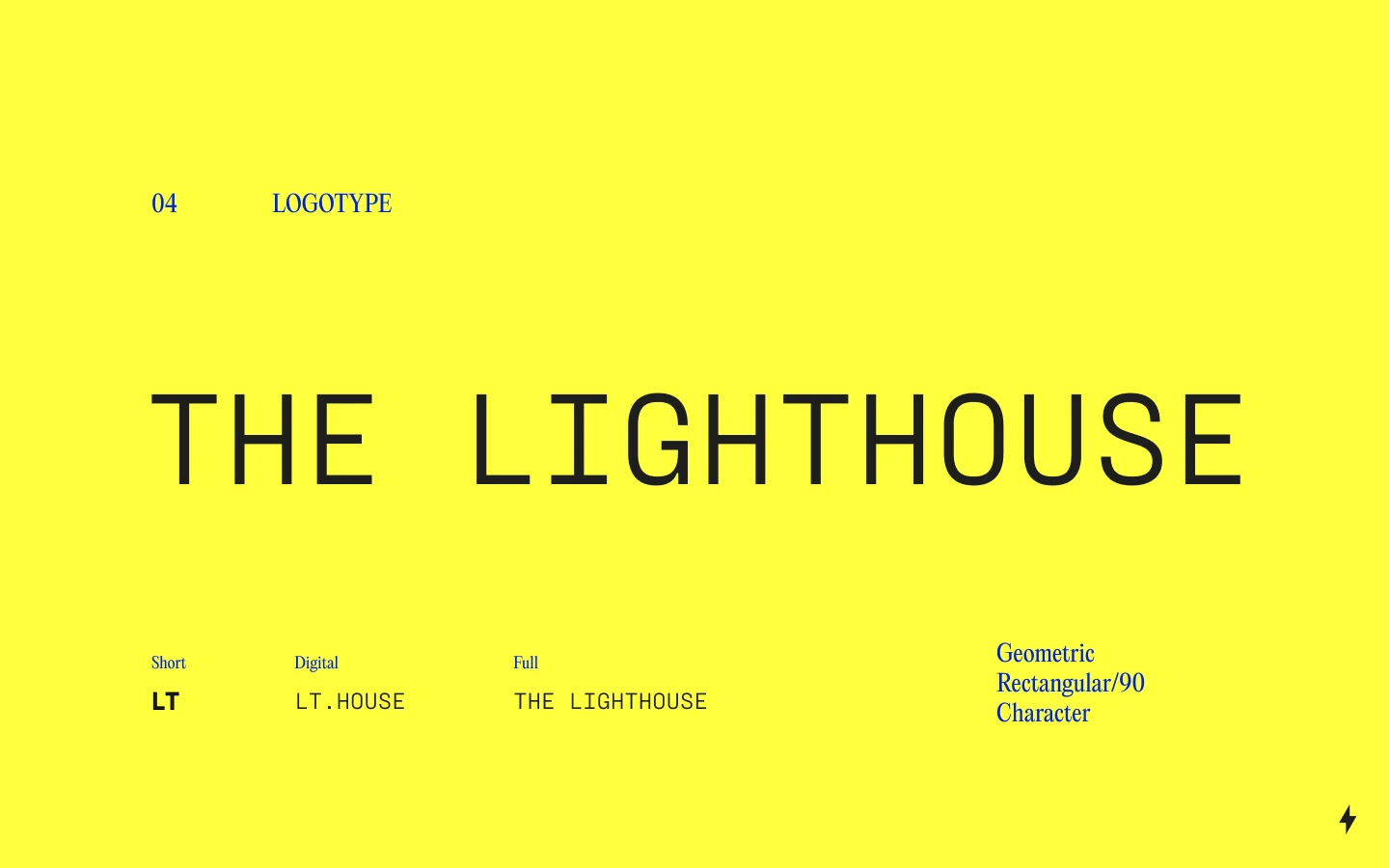
The belief comes first in the guidelines, in three lines over a picture, and the geometry follows from it: triangular, active movement, upward trajectory, every angle 90 degrees. The bolt is that geometry as a mark, the instant a spark becomes a decision, drawn hard-edged on the grid so it reads as discipline and never as a flash. The logotype has three lengths for three places, LT, LT.House and The Lighthouse, in a rectangular face built on the same right angle. Lightning yellow is the field rather than an accent, so a page from the fund is unmistakable at a distance, with cobalt, brick red and sand white doing the rest. PP Editorial New speaks the belief and Pragati Narrow labels the system, so the warm line and the working line are never set in the same face.
The house
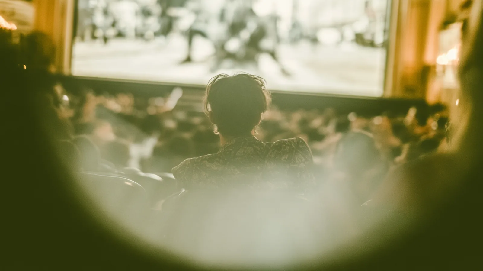
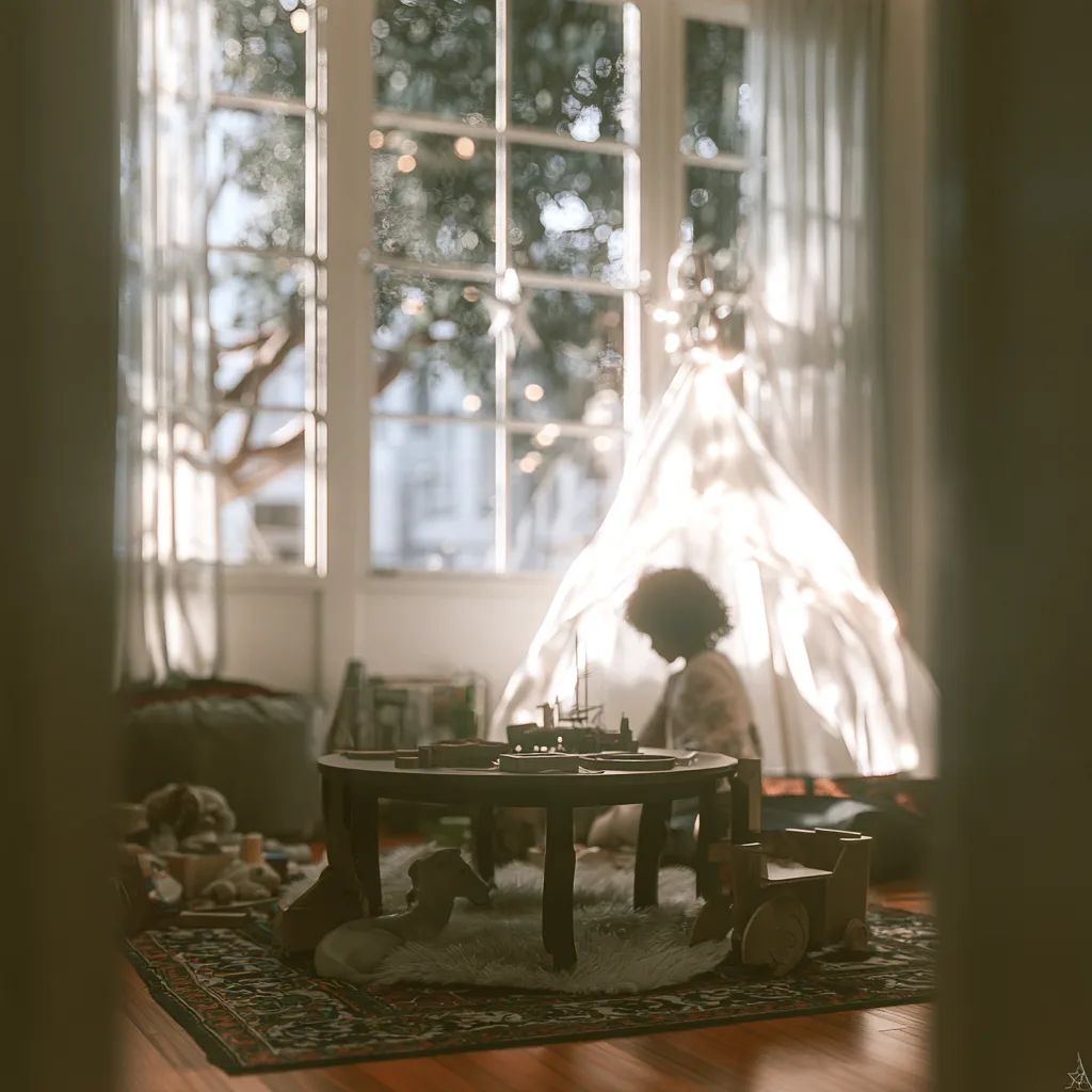
One voice, warm, conversational, curious and unpolished, and three tones for the three people it speaks to, in the deck's own words. To founders: direct, like a friend who's been there. To LPs: grounded, confident without performing, numbers when needed, story always. In the room: loose, real, the kind of thing you'd say with a drink in hand. The photography direction holds the same line: candid over posed, warm light, film over digital, low saturation, shallow focus and the odd motion blur left in, so every picture reads as a moment someone was in rather than a shoot.
Said out loud
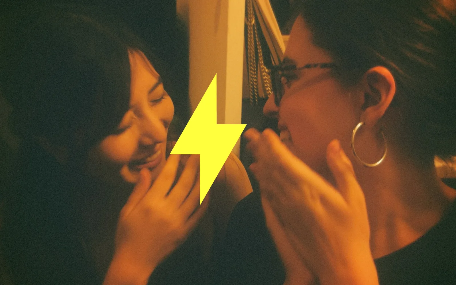
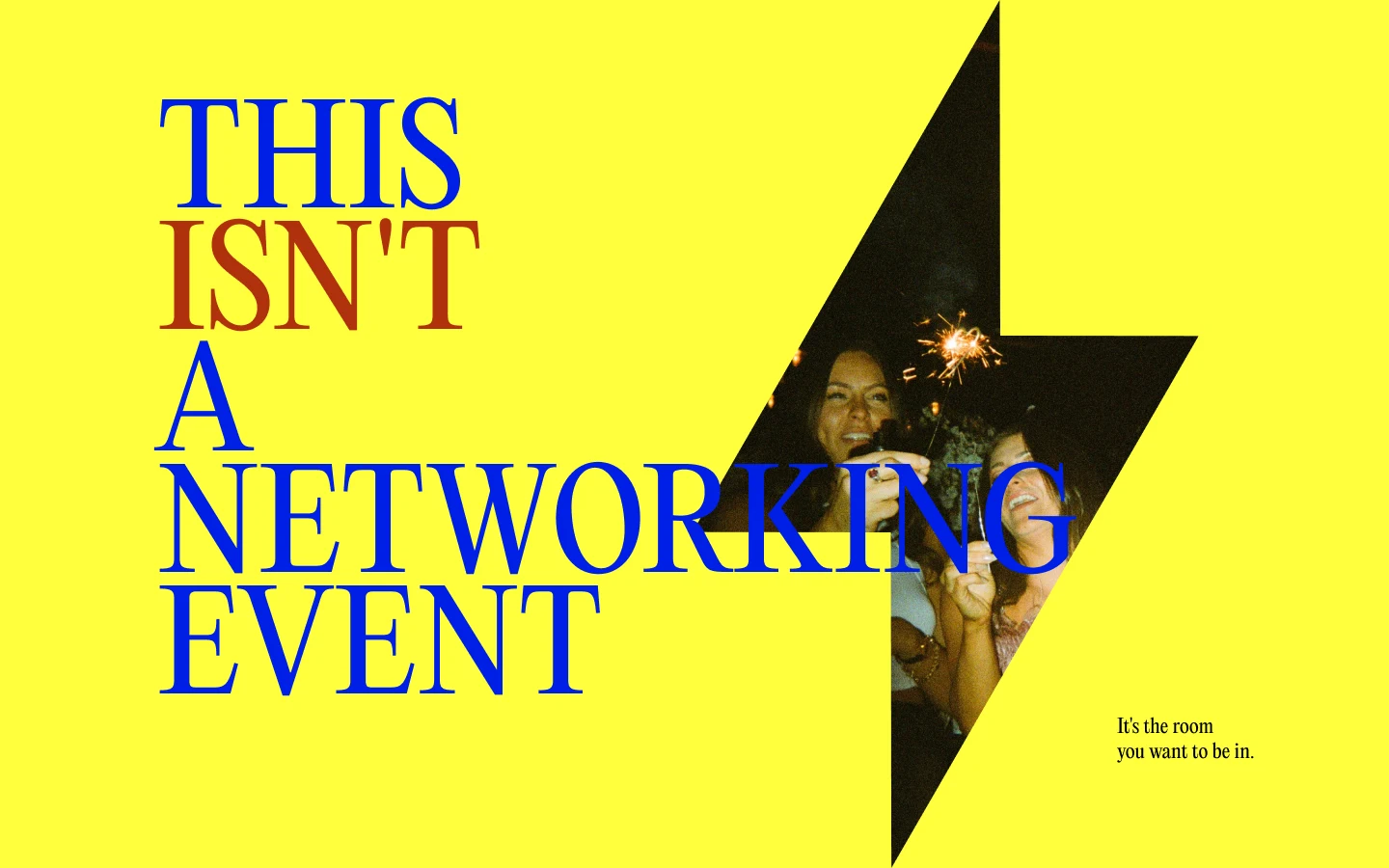
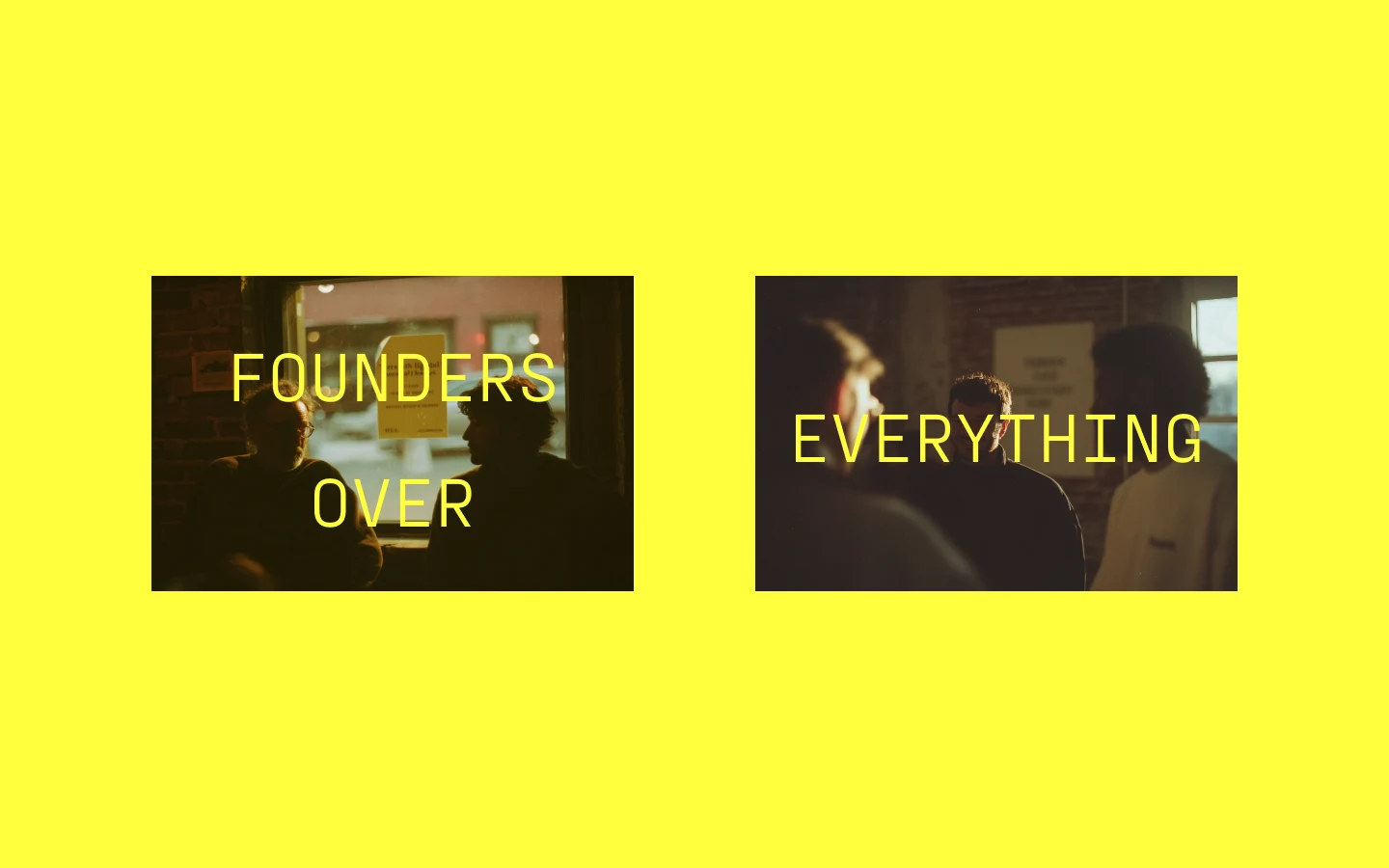
The expressions are where the belief is spoken. The bolt becomes a window onto a picture and carries the line that names the whole position: this isn't a networking event, it's the room you want to be in. A manifesto spread runs founders over everything across two frames, by builders for builders and never give up take the same treatment, and the guidelines close on Roosevelt's man in the arena, the standard for who the fund backs.
A founder who meets The Lighthouse now meets what the name promises before anyone has read a word: one signal, unmistakable at a distance, and a warm room once they are in it.
Delivered in 2026 as a complete set of guidelines: belief, geometry, the bolt and logotype, colour, type, voice, tone, photography direction and expressions.